Work
Game-Changing Brand Refresh Strategy for a Global Membership Association
Case Study: International Probiotics Association
SERVICES: Clarity: Brand architecture, visual identity | Creative: Sales tools

Strategy: Smart Brand Architecture for Expansion
We’ve solved complex brand challenges for a number of wellness brands, which caught the attention of the International Probiotics Association (IPA). An IPA board member invited us to tackle the IPA's expansion challenge—creating space for prebiotics and postbiotics without sacrificing their established position as the global authority in the industry.
After speaking with dozens of board members, industry leaders, and long-term members, we recommended that the organization keep the trusted IPA acronym and extend to a unified architecture with three distinct sub-brands for PRE, PRO and POSTbiotics. In doing so, we would preserve brand equity and avoid a costly renaming process with potential market confusion.
Creative: A Visual System with Strategy
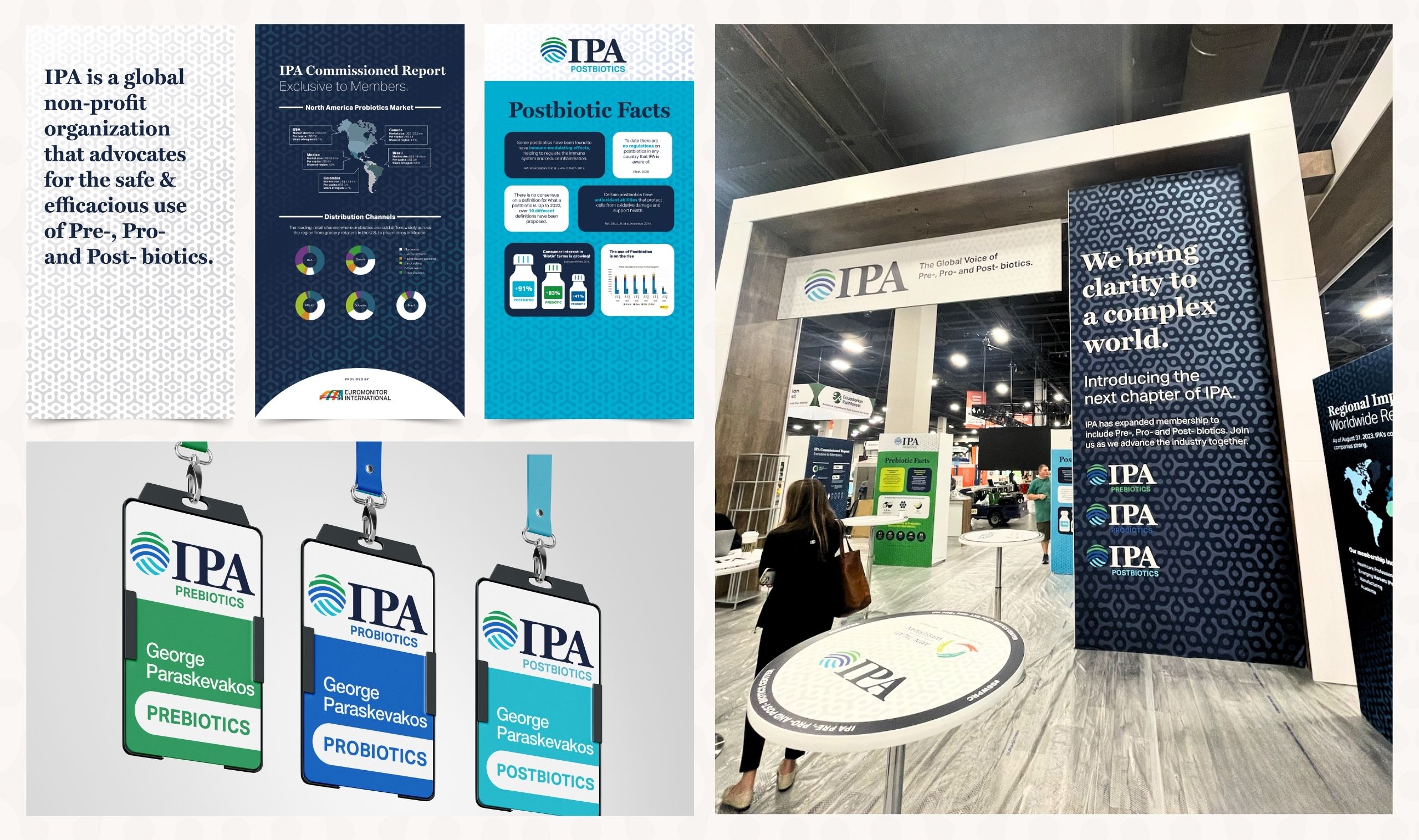
Our brand refresh strategy informed a new visual identity that elegantly communicated the brand’s expanded scope. The design solution used strategic color coding to distinguish sub-brands while maintaining a cohesive brand presence.
- Created globe-inspired logo symbolizing global unity across biotics categories
- Developed distinct color palette for each sub-brand (PRE, PRO, POSTbiotics)
- Integrated all sub-brand colors in parent logo for a unified approach
- Established visual hierarchy prioritizing the IPA parent brand
- Designed flexible system adaptable across all communication touchpoints

Activation with Impact
The refreshed brand identity launched successfully through strategic trade show presence and consistent sales tools. The new system enabled clear communication with multiple stakeholders while enhancing IPA's position as the global biotics authority.
- Developed comprehensive trade show materials showcasing the new brand architecture
- Created standardized presentation templates ensuring message consistency
- Provided core slides for volunteer communicators to maintain brand integrity
Original Trade Show Space & Branded Collateral

Refreshed Trade Show Space & Branded Collateral


Clarity & Creative Continues to Perform
After launch, IPA enhanced its perceived professionalism and authority in global markets. The clarity and creative assets supported clear differentiation between biotics categories while maintaining unified presence.

Rave Reviews.
See what our clients have to say about working with our team.

