Work
Honoring a Legacy, Redefining the Future
Case Study: Howard Medical Company Brand Refresh
SERVICES: Brand Strategy & Narrative | Creative, Content & Communications | Community Activation

The Challenge
Howard Medical Company has been a trusted source for medical supplies since 1978. Built from the ground up in Chicago, the family-owned distributor grew its reach beyond the Midwest. After decades of success, it faced challenges—outdated branding, unclear positioning, and a lack of messaging to highlight its superior customer service. As the business expanded under second-generation leadership, it was time for a health and wellness marketing transformation to redefine its role in the marketplace.
Defining the Brand
CLARITY: Brand Definition & Development
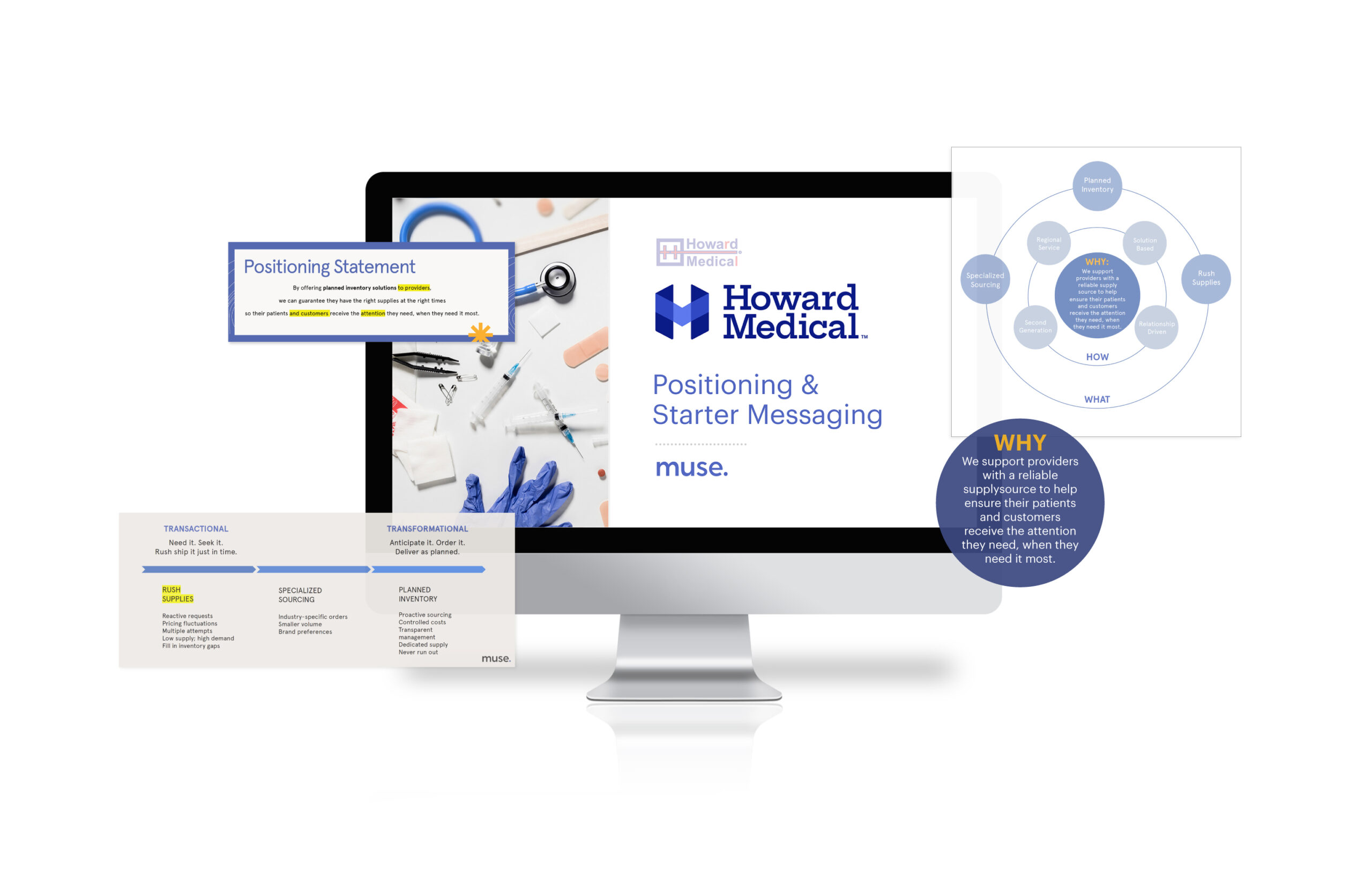
- Positioning: Through working sessions with Howard Medical leadership, we organized and defined the brand position using the Golden Circle framework, recategorizing their service set into three core offerings: Specialized Sourcing, Rush Supplies, and Planned Inventory.
- Narrative: We crafted messaging journeys that equipped the team to communicate effectively at every stage of the sales process.
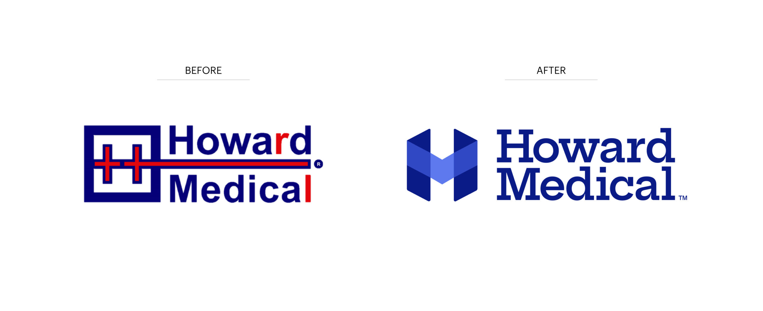
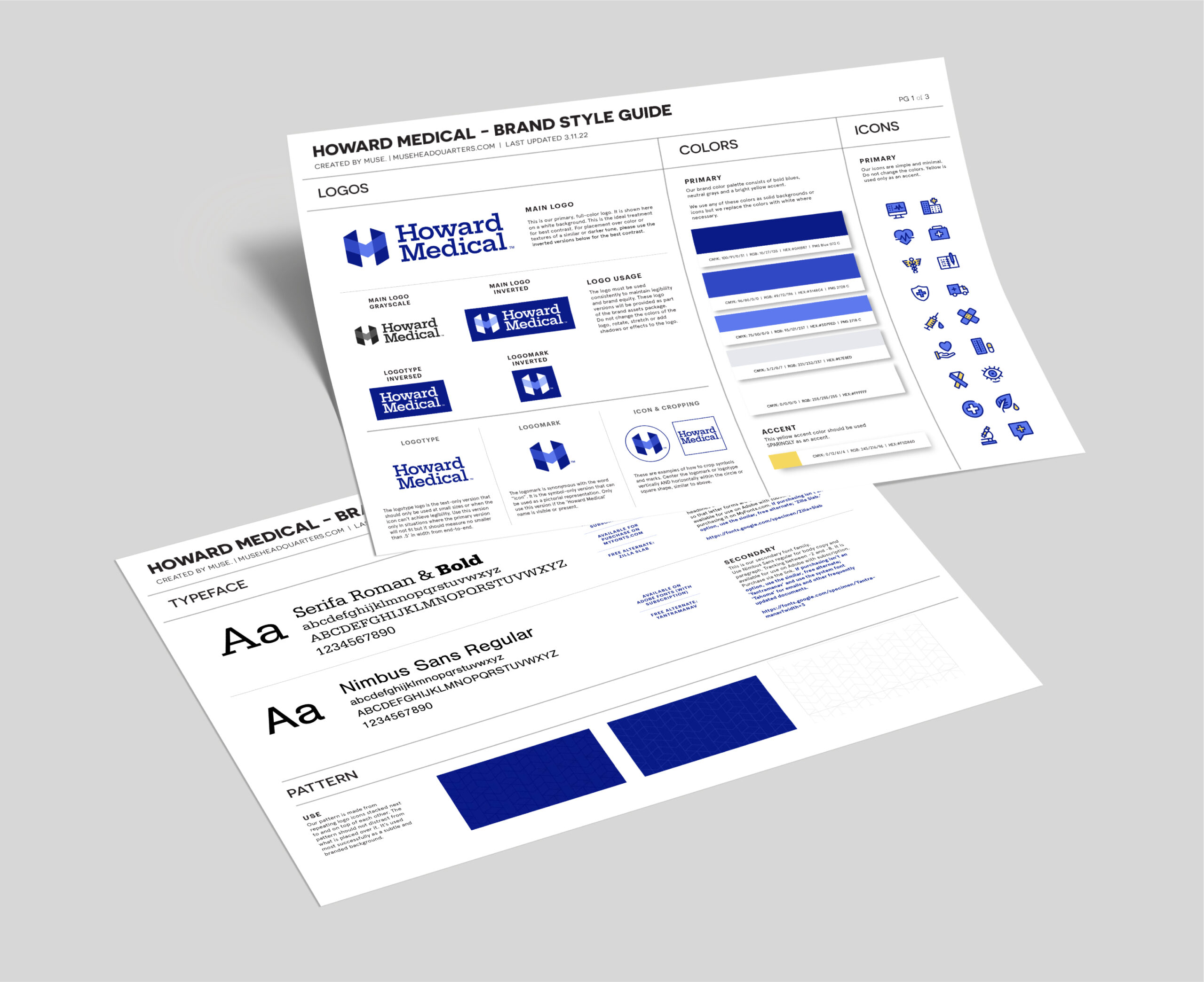
- Visual Identity: We refreshed their look with a bold, modern logo and crisp blue palette that reflected their values of integrity, strength, and connection while reinforcing trust and professionalism.
CREATIVE: Brand Activation & Expression
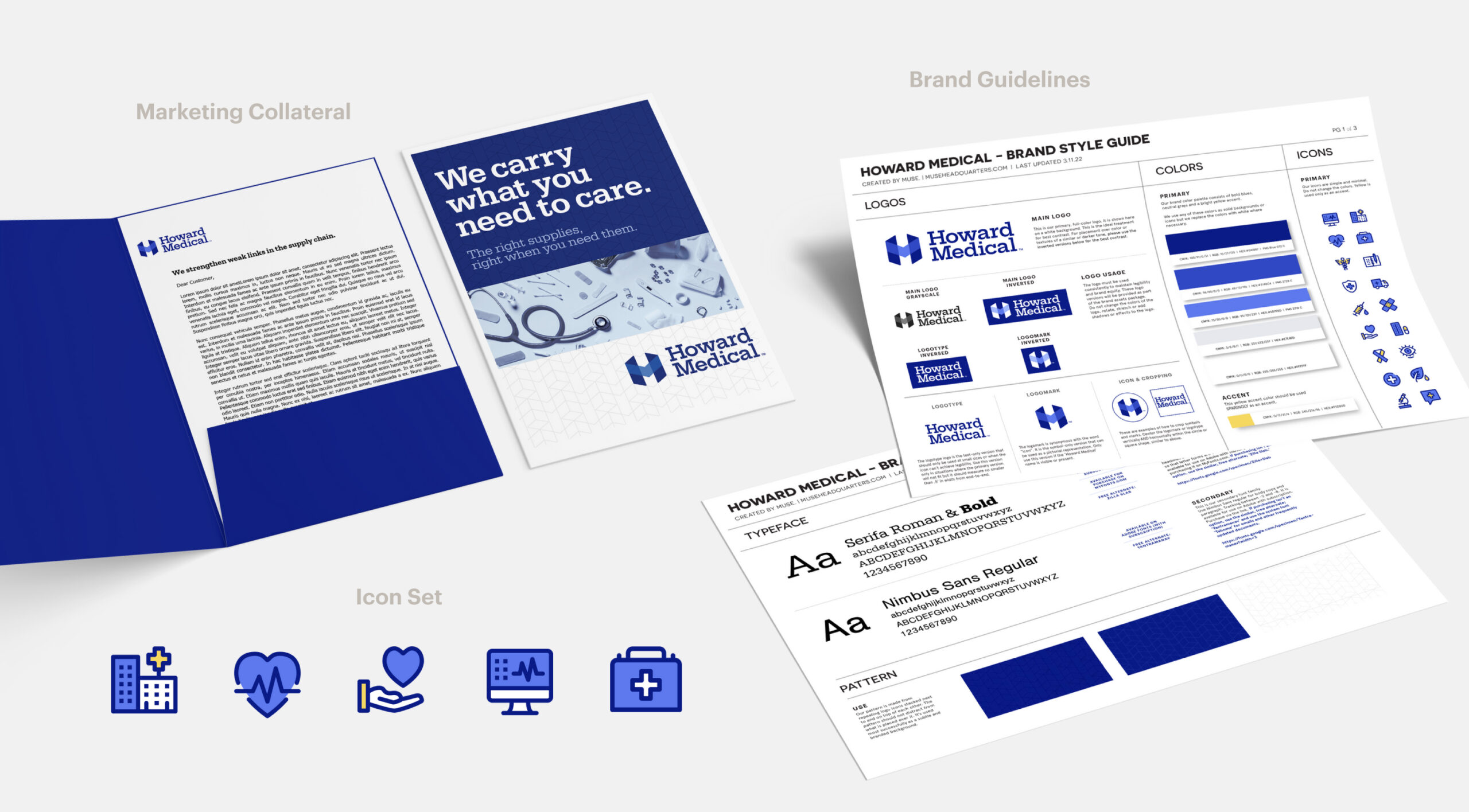
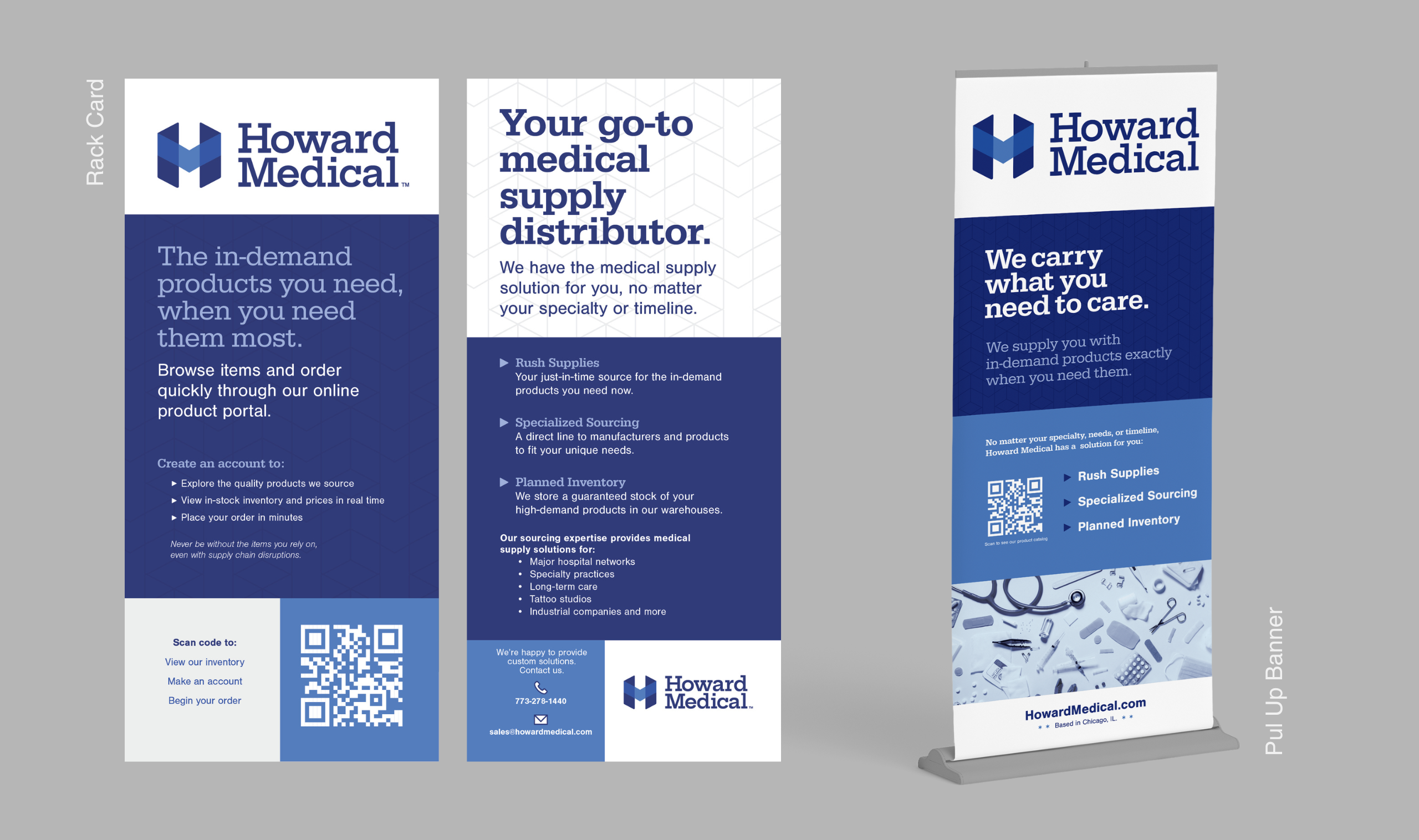
- Sales Tools: We custom-designed a compelling sales kit that equipped the Howard Medical sales team with brand materials and service sell sheets to effectively communicate and cross-sell offerings.
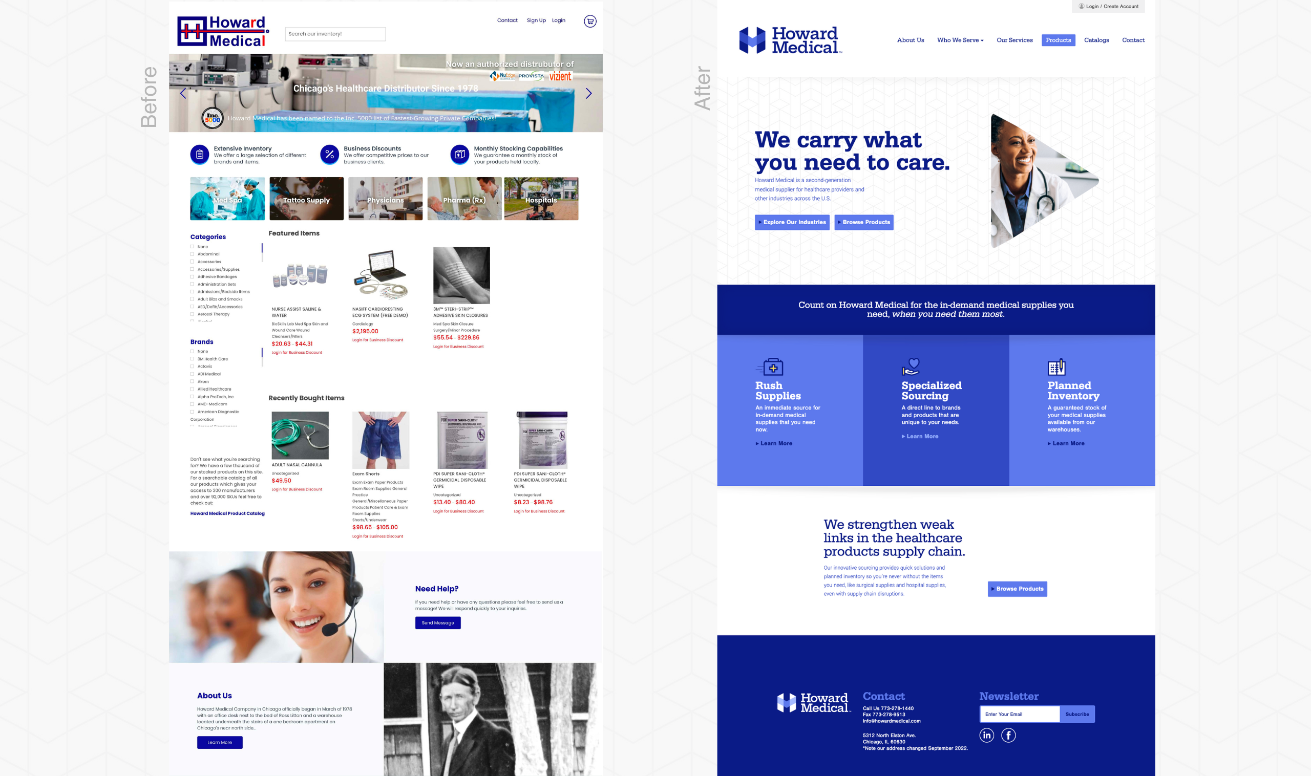
- Website: We partnered with the client’s web developer to redesign the Howard Medical website with a sleek, organized experience that communicated the new brand positioning and services while applying best-practice conversion UX to the online product portal.
COMMUNICATIONS: Brand Marketing & Management
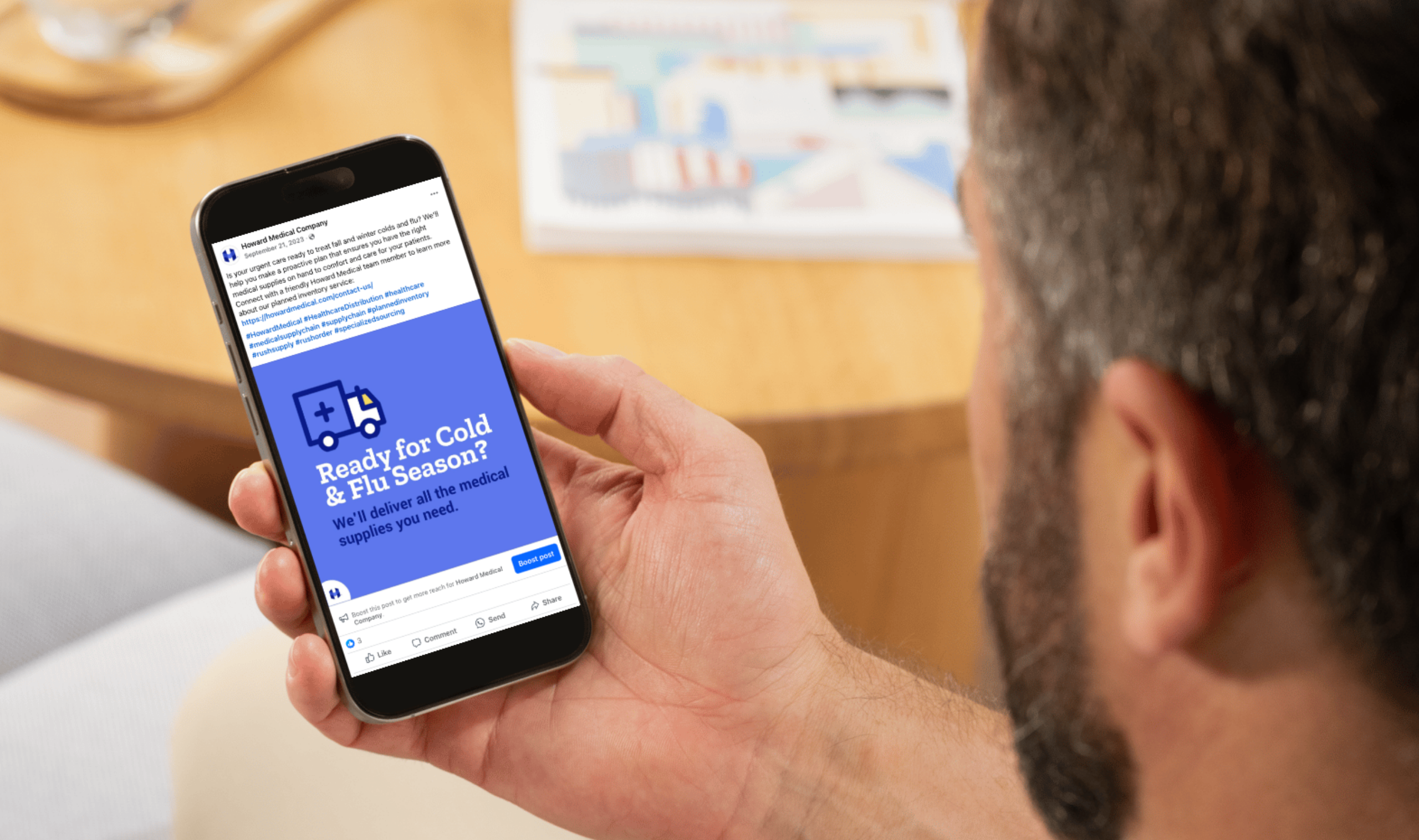
- Community Management: We implemented social media strategies that drove engagement and website traffic, resulting in significant growth across platforms.
Delivering Impact
The comprehensive brand transformation delivered impressive results:
- Digital Growth: 14% increase in sessions per user on the redesigned website
- Social Engagement: 234% jump in Facebook reach and nearly 20% growth in LinkedIn followers
- Client Confidence: Glowing feedback from customers and industry peers
“The Muse team made it easy for us to make decisions that we knew would last. They are branding wizards when I look at where we started to where we are now. Our whole team is so happy with the brand evolution and how it’s helped us confidently approach new accounts and continue to serve current customers.”
– Mark Litton, CEO
Redefining its identity has allowed Howard Medical to look to the future with renewed clarity. The brand's evolution empowers the team to serve customers and deliver in-demand products, proving that care is at the heart of everything they do.

Rave Reviews.
See what our clients have to say about working with our team.

